More than
just a brand
IMA’s visual identity reflects our unique perspective
in our approach to protecting your assets and making
an impact by serving in our communities.
IMA’s longevity, reputation for quality services and dedication to its customers make it a unique brand.
Understanding and implementing a brand architecture and adhering to a set of branding policies will maintain and build the IMA brand in the following ways:
1. Establish IMA’s identity as an industry leader.
2. Make it easy for customers to understand and choose their offerings.
3. Help present a clear, consistent, professional image.
4. Continue to build equity in the brand, setting the stage for the company’s future.

Logo
The IMA oval is the primary identifier for IMA and should be used accordingly to these policies. In an effort to present a clear, consistent and professional image, application according to these policies must be adhered to.
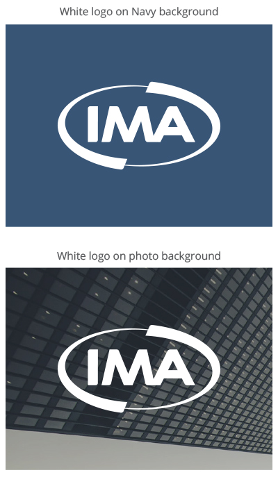
The navy IMA logo on white backgrounds should be used whenever possible. It’s important to use this option for first appearances on materials for optimal contrast and usage of brand color.
IMA LOGO APPROPRIATE USAGE
The IMA logo performs best when clearly visible and consistently placed according to the policies in this guide. The proper contrast between logo and background color optimizes visibility.
The 1-color white IMA logo option is a flexible option to be used on brand color backgrounds and on high-contrast photo backgrounds. Although the white version is an acceptable option, the Navy option on a white background is the preferred version for first appearances in materials.
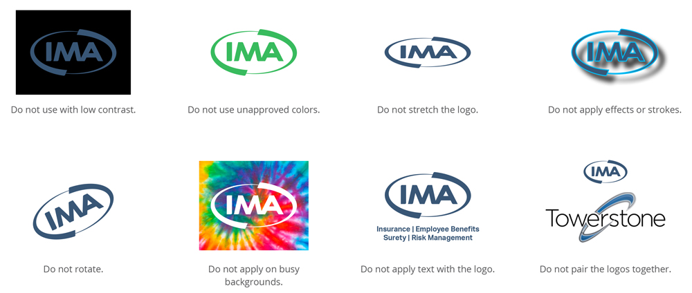
IMA LOGO INAPPROPRIATE USAGE
The IMA logo performs best when clearly visible and consistently placed according to the policies in this guide. The proper contrast between logo and background color optimizes visibility.

Colors
Our colors point to IMA’s longevity, quality and dedication by taking advantage of our strong visual foundation.
A shift to more white and a manageable range of distinctive secondary and tertiary colors, lets our visuals continue to work for us while letting us embrace a lighter and more breathable feel. We also have an audacious blue to add unique callouts – focusing on the details, mirroring how IMA approaches all challenges.
Our primary color palette consists of 3 main blue colors, 2 gray secondary colors and 1 tertiary color.
Negative space, notably white space, allows for better comprehension of messages and images without overwhelming the viewer with information.






Primary Visual Colors
IMA’s loyalty to our customers’ interests over our own and our unwavering commitment to our communities is represented in the stability of the primary blue colors. While focusing on precision and stability, the blue colors work to visually convey IMA’s depth of our and service.
These primary blue colors are used as backgrounds, headlines, buttons, callouts and overlays.
Loyal Blue
Loyal Blue
Hex: #385676
Pantone: 2955
CMYK: 24, 13, 0, 54
RGB: 56, 86, 118
Usage:
Logo, Backgrounds, Headlines, Buttons
Loyal Blue – Dark
Loyal Blue – Dark
Hex: #002442
Pantone: 282
CMYK: 100, 27, 0, 87
RGB: 0, 36, 66
Usage:
Logo, Backgrounds, Headlines, Buttons
Audacious Blue
Audacious Blue
Hex: #00b9f2
Pantone: 2199
CMYK: 95, 22, 0, 5
RGB: 0, 185, 242
Usage:
Backgrounds, Images, Buttons, Callouts
Secondary Visual Colors
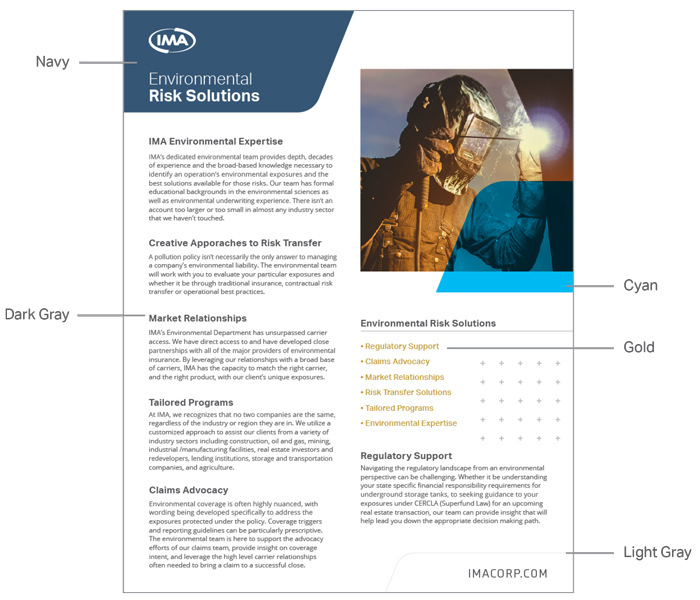
The secondary grays are utilized for copy, the pattern, and the outline version of the graphic box. While the gold color develops graceful continuity throughout the visual architecture.
Foundation Gray
Foundation Gray
Hex: #58595b
Pantone: Cool Gray 11
CMYK: 1, 1, 0, 64
RGB: 88, 89, 91
Usage:
Headlines
Groundbreaker Gray
Groundbreaker Gray
Hex: #898a8d
Pantone: Cool Gray 8
CMYK: 2, 1, 0, 45
RGB: 137, 138, 141
Usage:
Logo, Body Copy, Pattern, Backgrounds
Tertiary Visual Color
The secondary grays are utilized for copy, the pattern, and the outline version of the graphic box. While the gold color develops graceful continuity throughout the visual architecture.
Golden Hour
Golden Hour
Hex: #c09a38
Pantone: 1255
CMYK: 0, 15, 53, 25
RGB: 192, 154, 56
Usage:
Callouts, Minimal Backgrounds, Data/Stats
PRINT
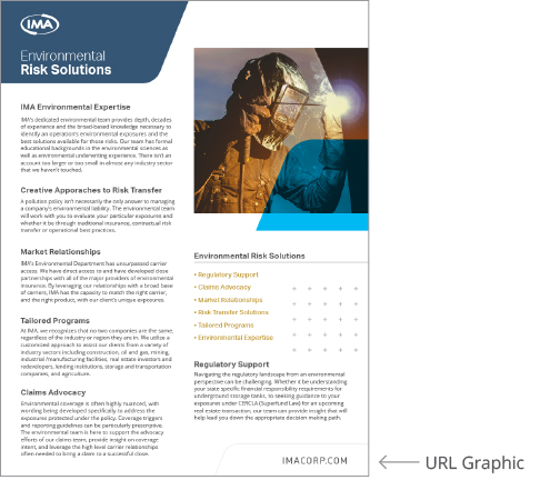
Slick Example
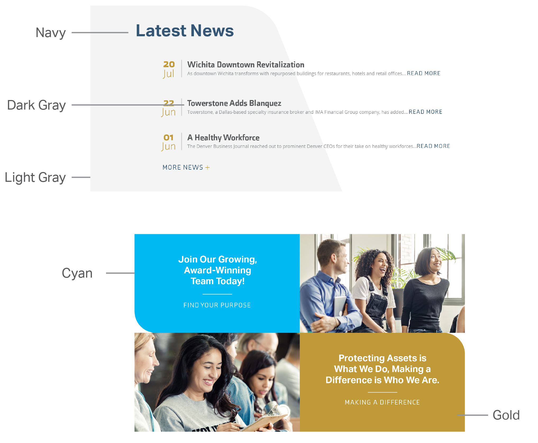
DIGITAL
Webpage Usage

Composition
Each of IMA’s touchpoints have the flexibility to be diverse with the brand system. Different designs become cohesive while utilizing the same brand assets according to the polices.
White Space/Less is More
White space is a key element of the various IMA applications. It exudes a professional and modern brand without overusing any of the brand elements. Each new layout does not need to feature every design asset available; rather, feature the elements that work best for the application and applied correctly.
Paragraph Justification
For printed pieces, paragraphs should be left justified.
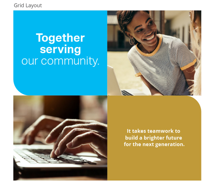
Grid Layout
The grid layout is a layout highlights images and copy in a unique way. With a grid of four rectangles round 1 outside corner only two of the rectangles that match. Do not round each corner.

Graphic Assets
The graphic assets have been designed to establish a consistent visual language for IMA and its subsidiaries. It is extremely important to use these elements according to these policies. Do no alter, or change in any way.
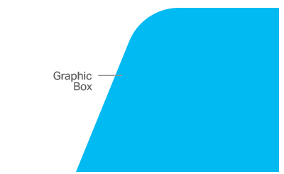
GRAPHIC BOX
The graphic box element derives from the corner of the swoosh in the primary IMA logo. By utilizing a subtle element within this logo we’re able to create a consistent family of visual language – all tying back to the foundation.
When used consistently this devices builds brand recognition through out all IMA applications. Be careful to utilize the graphic box or any of its iterations only once in a viewable area.
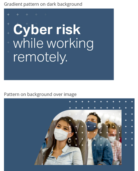
PATTERN
The plus pattern is a symbol of how IMA is more than just insurance. In addition to products and services, IMA provides expert knowledge of industry and solutions. When used on white backgrounds, the pattern works best in the light gray to not distract the viewer but still add visual interest.

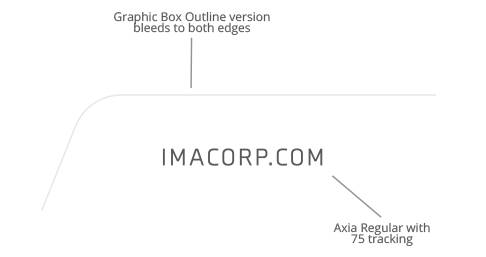
URL TREATMENT
The treatment of the IMA URL is an important element in the IMA brand system. Consistent URL treatment and placement creates another distinctive element that finishes each touchpoint. When possible, apply the URL lockup in the bottom right of the piece.

Icons
ICONS
Iconography should be single-line to match the style of the outline version of the graphic box asset. Icons can vary in degree of items, but should include a ‘plus’ symbol tie back into the more than just insurance concept of the voice. These techniques will not only help the icons be consistent with the IMA brand, but also will allow them to be customized to IMA.

Photos & Videos
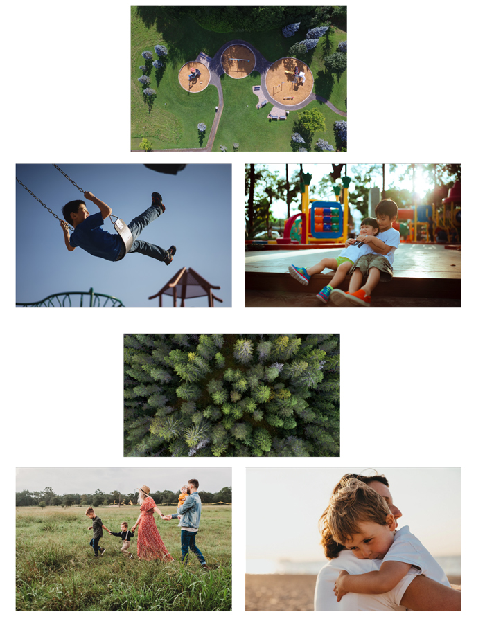
PHOTOS
Photography is a key element in the IMA brand.
The photography and video should feature people when applicable, keeping in mind emotions depending on the application.
VIDEOS
Unique perspective video shows how IMA has a unique way of looking at situations and provides solutions.
Starting with close intimate shots of a scene shows IMA’s interest and understanding their clients and their needs on a personal level. Juxtapose this with a high-level view to show the bigger picture, the peace of mind that IMA is also able to see what lies ahead (future, industry experts).
STORYTELLING PHOTOGRAPHY
IMA storytelling uses a combination of photos to further communicate a narrative. When pairing photography, there are two differentiating images that bring this story to life:
- A larger view of the message.
- The second image often views closer to the subject matter, or focuses clearly on the point.
SUPPORTING PHOTOGRAPHY
Support the content in a fairly straight-forward manner. When necessary, look for images that have a unique perspective or people to further the message of the content. Using people when possible reinforces the primary reason for insurance.
PHOTO EDITING
CROPPING
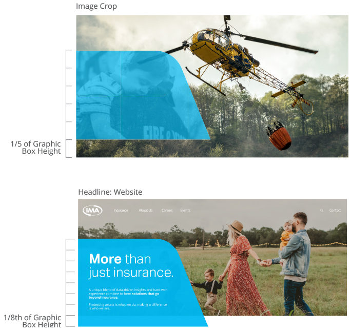
Crop an image to highlight certain parts within the photo to help tell a story. This can allow for a create a unique perspective to make it stand out from the original image. More intimate crops can add focus to a subject or make a stronger emotional connection.
COLOR EDITING
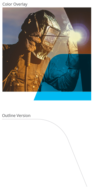
Color editing with brand colors creates cohesion between graphics and images.
BLUE OVERLAY
Use the graphic box to create visual interest within a photo or a design.

Typography
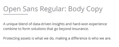
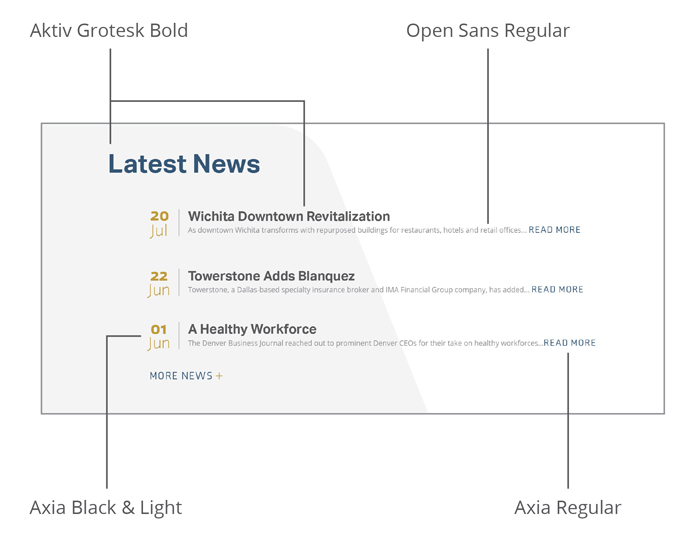
Aktiv Grotesk This versatile typeface is bold, professional, and authoritative.
Main headlines utilize a combination of Bold and Light weights to call attention to certain words. Smaller headlines can be set in all Bold.
For body copy, use Open Sans Regular filling with IMA’s Dark Gray color.
Axia When used sparingly, this font brings concise letterforms to small buttons and call-outs.
PRINT
Slick Example
DIGITAL
Webpage Usage


